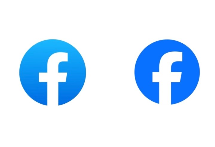
There were probably many meetings, some of them drifting beyond regular work hours. Whiteboards likely saw much scrawling and a good deal of wiping. Discussions were probably heated, fists banging on tables as proposals were defended against scornful criticism. And after all that work, after all that intense input, Facebook’s new logo is … well … almost identical to the old one.
Facebook owner Meta recently decided that the social networking platform was due a brand refresh, but not quite on the scale of the one that saw Twitter recently transform into X, a drastic overhaul that banished the iconic blue bird logo in favor of a black-and-white “X.”
Realizing that the white “f” on a blue background continues to have massive global recognition, the Facebook team behind the refresh decided it would be a good idea to go with a white “f” on a blue background. With a couple of very subtle changes.
Here’s the team describing its approach:
“Our intention was to create a refreshed design of the Facebook logo that was bolder, electric and everlasting. Each of the distinctive, new refinements drive greater harmony across the entire design as a key element of the app’s identity. We’ve done this by incorporating a more confident expression of Facebook’s core blue color that is built to be more visually accessible in our app and provides stronger contrast for the ‘f’ to stand apart.”
Which can basically be summed up as: “Bigger ‘f’, darker blue.”
Facebook’s director of design, Dave N., said the goal of the team’s work was to “expand upon our foundation and create the defining mark of our brand that anchors the identity system across Facebook.”
He added: “We wanted to ensure that the refreshed logo felt familiar, yet dynamic, polished and elegant in execution. These subtle, but significant changes allowed us to achieve optical balance with a sense of forward movement.” So, are you feeling that optical balance and a sense of forward movement?
Facebook’s wordmark has also been redesigned “to create a consistent treatment and improve overall legibility across Facebook,” a redesign that is again hard to spot but which apparently allowed the team behind it to “build upon the heritage of our identity, while creating a stronger relationship between how the wordmark pairs with the rest of the typeface.”
The changes are certainly subtle, an approach that the team ultimately considered as the best way forward for a brand that’s already doing rather well, with an incredible 3.08 billion people — or 38.4% of the global population — checking their Facebook account at least once a month.
Editors’ Recommendations


